How we build websites?
Sequencing, timeframes, support, hosting
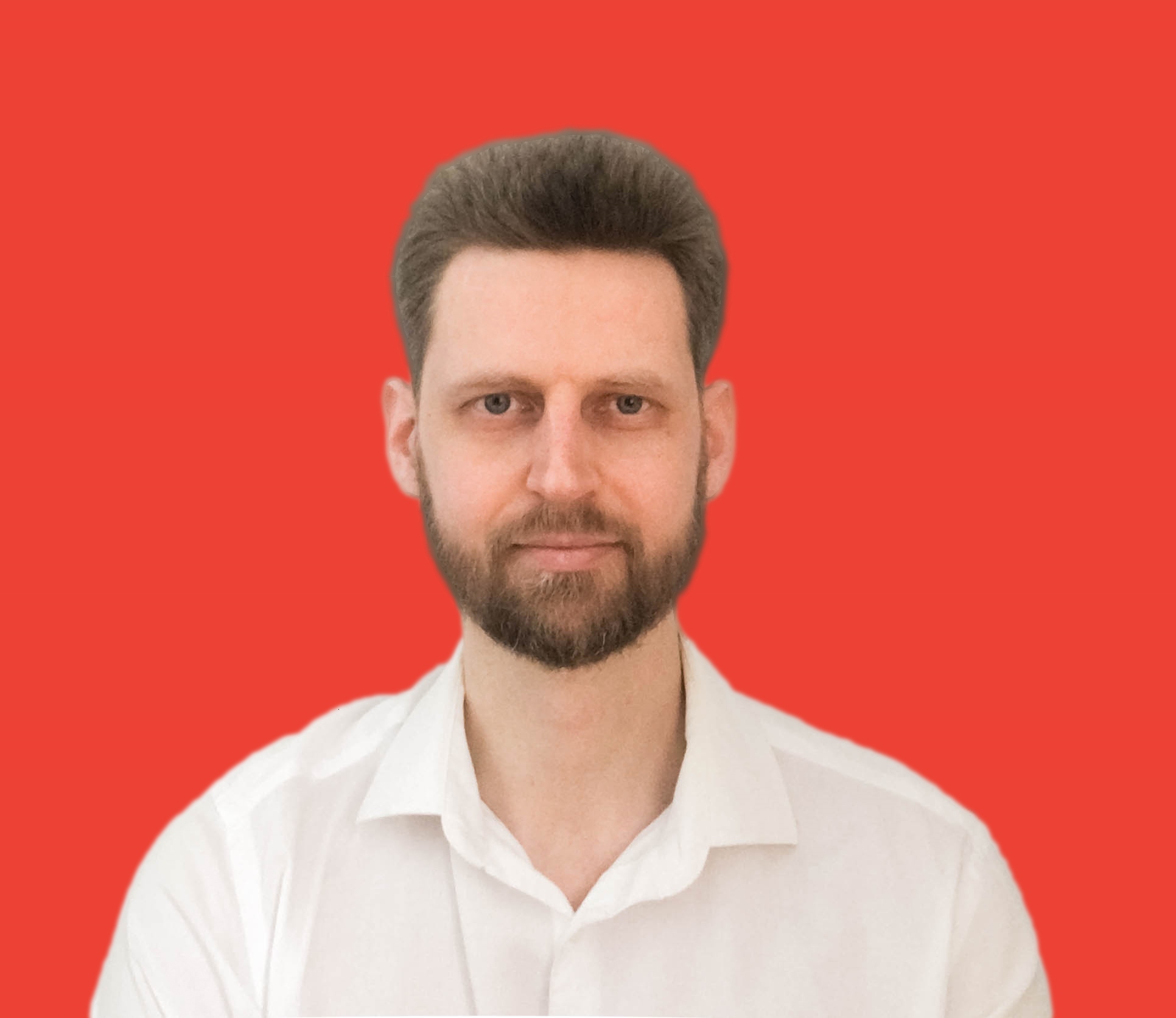
We don't make websites to make money, we make money to make beautiful websites.
Founder, Bob Bratash
80% of websites are not good enough to be noticed
15% are good enough to deal with
5% are the best of the best
Web design has been improved dramatically over the past 20 years, but the 80% - 15% - 5% distribution is still working . . .
Leaders still have the best look in the market and win 80% of leads. Others just try not to fall behind
Moreover, 80% of firms with a «marketing website» transfer leads to 20% of firms with a «remarkable website»
Anyone can create a website, but only professionals can create a great one that will be a competitive advantage for you
It's time to stand out in the market,
create a remarkable website, and start getting
your ideal clients with ease
CLEARHEART
Affinity website
a traditional scrolling corporate website solution
with beautiful design

Branding content
5-10 pages
Design
Scrolling + Minimalism
Technology
Blazor Server + Js
Strategy
within 1 week
Minimal viable version
within 1 month
Perfect version
within 3 months
Subscription
150$/ month
for 3 years, then free. cancel anytime
Total amount
$5400
3 years * 12 months * $150
CLEARHEART
Affection website
A unique flip-through corporate website solution with beautiful design

Branding content
5-10 pages
Design
Flip-through + Minimalism
Technology
Blazor Server + Js
Strategy
within 1 week
Minimal viable version
within 1 month
Perfect version
within 3 months
Subscription
150$/ month
for 3 years, then free. cancel anytime
Total amount
$5400
3 years * 12 months * $150
Branding
Design
Development
Branding
Research
Differentiation
Concept
First of all we research competitors.
Then we come up with a marketing concept that will strengthen the company's position in the market.
DESIGN
Logo + Font
Colors
Pages
We design or redesign the logo and choose the font.
Then we play with color schemes.
After that, we design 3-5 pages so you can feel the final result.
DEVELOPMENT
Desktop
Mobile
Tablet
We use different layouts for desktop and mobile because of the huge difference in user experience.
We start with desktop, mobile comes after, and tablet appears in the end.
We don't use CMS like WordPress and so on. We develop websites on .Net Blazor Server + Js.
TimeFrames
1 week
1 month
3 months
Research and First result - 1 week for
Minimal Viable Version - 1 month
Perfect Version - 3 months
IMPROVEMENTS
Content
Design
Development
Over time, design solutions become outdated.
That's why we make updates from time to time to keep the design at a high level and look modern.
We want our websites to delight your potential customers all the time.
CONTENT MODIFYING
Admin panel
95% our clients love to send us information, and we just add it to the site,
This is much easier for them than spend time to log in and create posts.
For advanced users who are forced to post often, we create an admin panel for free.
A website without an admin panel loads faster.
SEO
SEO friendly
All of our websites are SEO-friendly.
You can fill in all the required fields for the Google search engine.
We also plug in Google Analytics, Facebook Pixel etc.
HOSTING
Dedicated server
On regular hosting you can't manage a server, so your site has limited resources and it competes for them with a thousand sites of other clients.
That's why we rent a dedicated server to ensure that your site has all the necessary resources it needs to run quickly and reliably.
SUPPORT
Full support
You can contact us at any time and we will make changes to the site within a day.
If there are a lot of edits or they are large, it may take 1-2 days.
PERFECTION
The best we can do
We strive to do our job with the highest quality, so we can throw away our work, even if you like it. We will find another solution you are going to like, but we will stick to our standards.
TRUST
Just leave it to us
You can't tell us exactly what we should do, instead, we expect you to tell us what you like or don't like so that we can fulfill your wishes in the best way.
RESPECT
Respectful attitude
Our desire to do more for you grows exponentially when we feel a respectful attitude, admiration and joy.

Bob Bratash, CEO & Founder
In 2002, Bob started a career as an IT technology implementation specialist. Then he worked as an economist, marketer, salesperson, head of development, corporate manager, etc.
In 2008, Bob opened his own accounting automation company for businesses called «Configurator».
From the beginning, he faced the need to develop a logo, beautiful website, content, etc. Since his budget was limited, he decided to gain knowledge and skills in this area.
In 2015 Bob started the «Activator» company to offer a full range of marketing services.
Ground on developing expertise and having deep knowledge of design, in 2018 Bob started «Clearheart Agency» to offer premium web design solutions for businesses in the US, Canada, and EU.
In 2021 Clearheart Agency created a unique website navigation solution called «Affection» which allows users to flip pages instead of scrolling.
Bob believes that the basis of an excellent result is the desire to help the client from the bottom of the heart, then professionalism and business skills.
Being honest with the client and having an open heart is the foundation of the philosophy of all his businesses.
Branding
Browser tabs competition
When ordinary users watch your website, they still have 5-10 tabs open with potentially useful information that need to be processed as soon as possible.
It takes 5-10 seconds for a user to quickly scan and close the unuseful tab, leaving 2-3 tabs to dig in.
Our goal is to go through the user's mental filters, attract attention and stay in the client's browser.
Design in real environment
Unlike the user, the designer and the client tend to focus on their brainchild in isolation environment because they often have only one website open before their eyes that they work on.
To create the website, you have to design and test website with the mind of real user's behavior.
To do that, open next to your website 5-10 competitor's ones.
Attention
Attention is a forecast that did not come true.
Attention works in such a way that it skips everything of the same type and stops at the unusual.
In order to win the competition between open tabs and stay in the user's browser, your homepage should be bold and different.
Scanning mode
Users are overwhelmed with information.
On average internet users in the US visit over 130 web pages per day. Imagine if users would read everything they looked at. They would spend all their time on this.
To deal with that, users browse in scanning mode. Most of the time they quickly scroll and scan without reading every word. Their attention is blurred.
Reading mode
If there is a lot of information on the screen, instead of reading users switch to scanning mode and treat text as a picture.
To switch users into reading mode, you have to dose information.
Less is more.
One screen - one thought
People are overwhelmed with information. But they are able to consume a lot of information in small pieces.
Two and more blocks of information on one screen are switch users to scanning mode.
One screen - one thought principle allows users to read without scanning.
Design
Aesthetics
Aesthetics is the way to the client's heart.
Aesthetics includes factors such as balance, color, movement, pattern, scale, shape and visual weight.
There is a lot of design on the internet, but not so much real aesthetics.
Colors
More than 3 colors make the website look complex.
Use one color as the base color, the second as a complimentary, and the third as an accent color.
The amount of accent color should be no more than 15%.
